


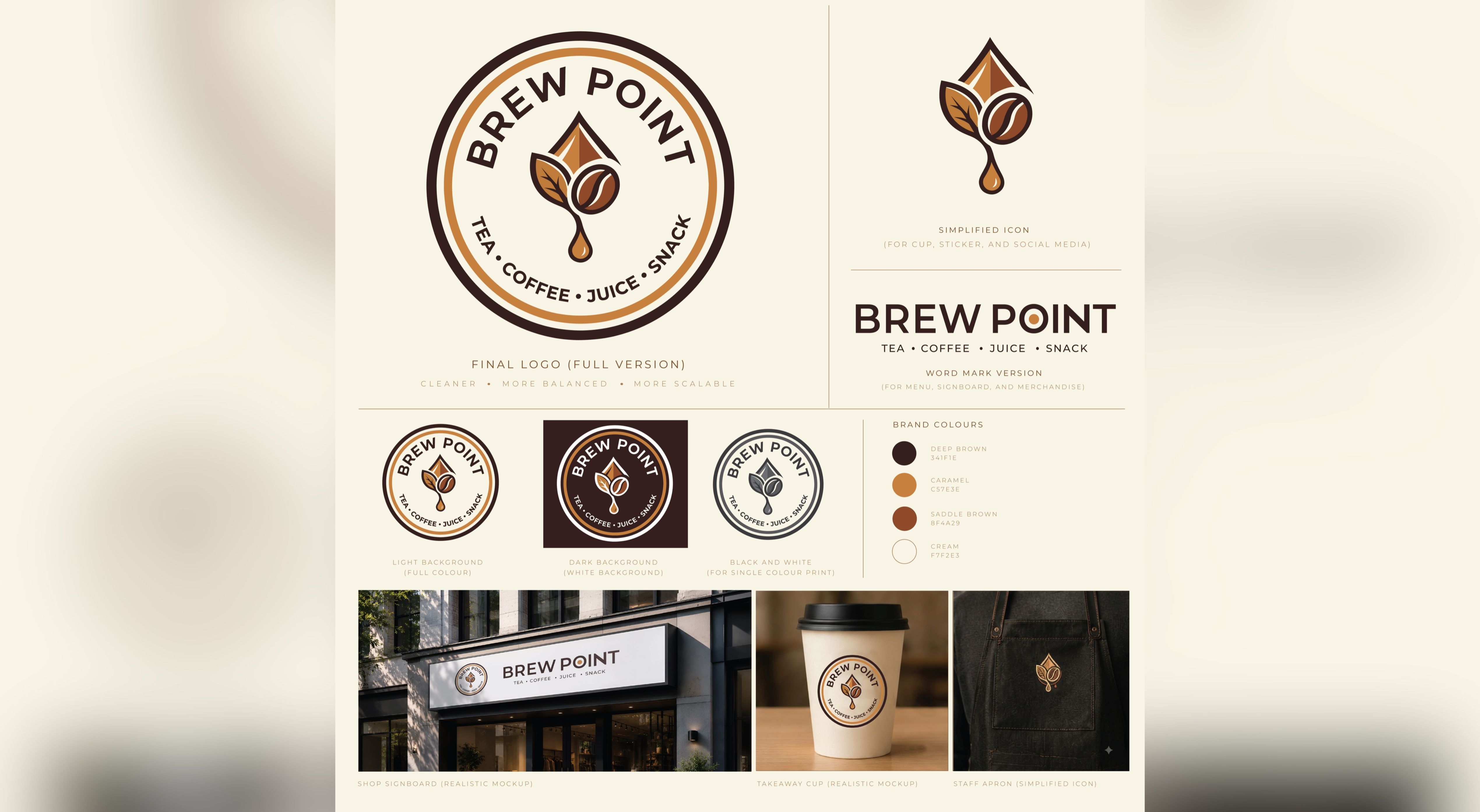
Canvas Chrome Designs worked on developing the visual identity and brand guidelines for Brew Point, a beverage and snack brand offering tea, coffee, juice, and snacks. The objective was to create a cohesive identity that communicates warmth, quality, freshness, and a welcoming café experience.
The branding needed to work across multiple customer touchpoints, from storefront signage and takeaway cups to staff apparel, menus, stickers, and social media. We therefore focused on creating a distinctive logo system supported by a consistent colour palette, typography, and practical brand applications.
The central logo features a combination of coffee-inspired elements, including a coffee bean, leaf, and a stylized droplet. These elements come together to represent the brand's beverage offerings while creating a recognizable visual symbol.
We developed a circular badge-style logo as the primary identity, featuring the brand name BREW POINT and the descriptor TEA • COFFEE • JUICE • SNACK. Alongside it, we created a simplified standalone icon for smaller applications and a horizontal wordmark version for menus, signboards, and merchandise.
The brand guidelines establish a warm and inviting visual language through a carefully selected earthy colour palette:
Deep Brown (#341F1E): Represents richness, warmth, and sophistication.
Caramel (#C57E3E): Adds warmth and reflects coffee-inspired tones.
Saddle Brown (#8F4A29): Provides depth and visual contrast.
Cream (#F7F2E3): Creates a clean, welcoming background.
The final presentation also demonstrates how the identity translates into real-world applications, including shop signage, takeaway cups, and staff aprons.
Creating a distinctive identity for a brand offering multiple beverage and snack categories.
Developing a logo that balances café aesthetics with strong brand recognition.
Ensuring the logo remains legible across different sizes and applications.
Establishing a consistent colour system for light, dark, and monochrome backgrounds.
Demonstrating how the identity would work across physical retail and packaging touchpoints.

We adopted a warm, contemporary branding direction inspired by coffee culture and the welcoming atmosphere of a neighbourhood café.
Our approach focused on building a flexible logo system rather than relying on a single logo variation. The primary circular badge provides a recognizable identity, while the simplified icon and wordmark offer flexibility across different applications.
We also prepared visual brand guidelines to establish consistency in logo usage, colour selection, and brand presentation.
To demonstrate the practical application of the identity, we developed realistic branding mockups featuring:
Café storefront and shop signboard.
Takeaway coffee cup branding.
Staff apron branding using the simplified icon.
Primary logo on light backgrounds.
Reverse logo application on dark backgrounds.
Monochrome logo variation for single-colour printing.
This ensured the identity could be implemented consistently across the brand's physical and digital presence.
Adobe Illustrator
Adobe Photoshop
Primary Logo Design
Simplified Brand Icon
Horizontal Wordmark Version
Logo Variations for Light and Dark Backgrounds
Black & White Logo Version
Brand Colour Palette with HEX Codes
Brand Identity Guidelines
Storefront Signage Mockup
Takeaway Cup Branding Mockup
Staff Apron Branding Mockup
High-Resolution JPG Files
Transparent PNG Files
Vector AI File
PDF Version
Print-Ready Brand Assets


Brew Point received a cohesive brand identity supported by practical visual guidelines and real-world branding applications. The flexible logo system and carefully defined colour palette provide a consistent foundation for presenting the brand across storefronts, takeaway packaging, staff uniforms, menus, promotional materials, and digital platforms.
The resulting identity gives Brew Point a recognizable visual personality that reflects its tea, coffee, juice, and snack offerings while maintaining a warm and approachable café aesthetic.
No comments yet. Be the first to comment!







Leave A Reply