


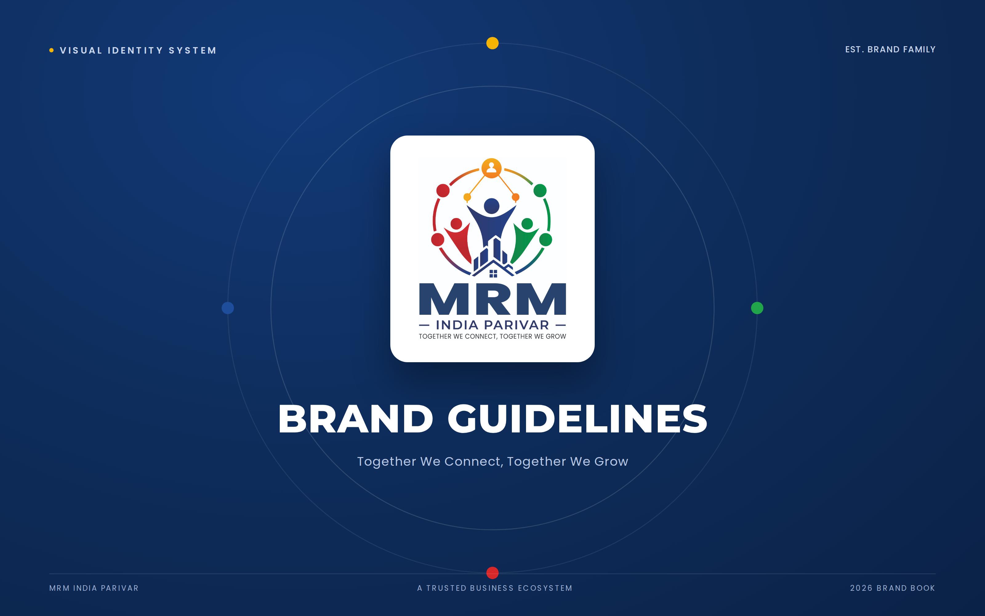
After rebranding MRM Group into MRM India Parivar, the next step was creating a complete brand identity system that could maintain consistency across every customer touchpoint.
The objective was to build a professional brand guideline document that would help internal teams, franchise partners, marketing agencies, and future designers use the identity correctly while preserving brand consistency as the company expands across multiple industries.
The guidelines document serves as the single source of truth for the visual and communication standards of MRM India Parivar.
Brand Name: MRM India Parivar
Tagline: Together We Connect, Together We Grow.
To build a trusted business ecosystem that empowers individuals through entrepreneurship, employment opportunities, real estate, FMCG, and future business ventures.

The visual identity was designed to communicate:
Trustworthy
Community-Driven
Progressive
Inclusive
Entrepreneurial
Professional
Growth-Oriented
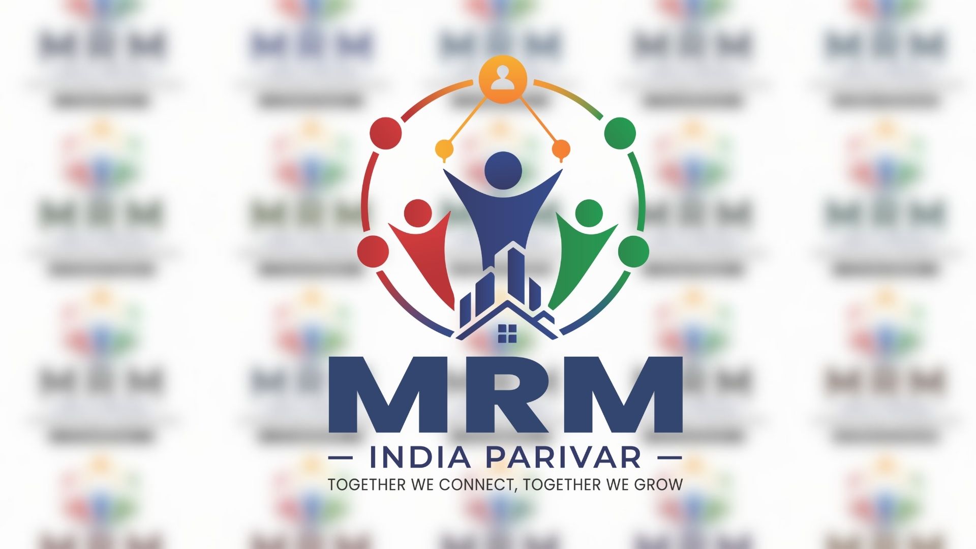
The MRM India Parivar logo represents a united ecosystem where people connect, grow, and succeed together.
Central Human Figure
Leadership
Vision
Success
Supporting Human Figures
Community
Teamwork
Network Marketing
Partnership
Circular Ring
Unity
Endless Growth
Nationwide Network
Building Icon
Real Estate Foundation
Business Development
Wealth Creation
Five Human Figures
Expansion into multiple industries
Inclusive business opportunities
Strong nationwide family network

To ensure flexibility across every application, three official logo variations were created.
Full-color logo with tagline.
Use for:
Website
Office branding
Brochures
Social media
Corporate presentations
Logo without tagline.
Use for:
Small print
Mobile applications
Favicons
Merchandise
Circular symbol only.
Use for:
App icon
Social media profile
Watermark
Favicon

Logo Usage Standards:
Clear Space 
A dedicated exclusion zone was defined around the logo to ensure maximum visibility and legibility across all applications.
Maintain clear space equal to the height of the small circular head (X) on all sides.
No text, graphics, or images may enter this zone.
Minimum Width: 30 mm
Minimum Width: 150 px
For sizes below these dimensions, the icon-only version is recommended.
A vibrant multi-color palette was developed to represent diversity, opportunity, trust, growth, and progress while maintaining a modern corporate appearance.
The colors also align with the client's original vision of incorporating Red, Yellow, Blue, and Green into the identity.

A modern typography system was established for consistency.
Montserrat
Use for:
Headlines
Titles
Signage
Weights:
Bold
SemiBold
Poppins
Use for:
Body text
Presentations
Marketing material
Weights:
Regular
Medium
The communication style was defined to remain:
Positive
Motivational
Trustworthy
Family-oriented
Professional
Growth-focused
Sales-heavy or overly aggressive messaging was intentionally avoided to strengthen long-term brand credibility.
The guideline includes recommendations for imagery that reflects the company's vision.
Preferred imagery includes:
Business success
Teamwork
Families
Professionals
Entrepreneurs
Real estate
FMCG products
Community events
Leadership
Training sessions
Dark or negative imagery is discouraged to maintain an optimistic and welcoming brand perception.
The icon system follows a modern corporate style.
Flat
Minimal
Rounded
Corporate
Modern
Avoided skeuomorphic or overly decorative icons.

✓ White
✓ Light Grey
✓ Navy Blue
✓ Solid Dark Background
❌ Busy photographs
❌ Low contrast backgrounds
❌ Similar colored backgrounds
The brand manual also documents improper logo usage to protect brand consistency.
Stretching
Compressing
Rotating
Changing Colors
Adding Shadows
Adding Outlines
Rearranging Elements
Replacing Fonts
Using Unauthorized Gradients

The identity system was designed to work consistently across every business touchpoint, including:
Corporate Stationery
Business Cards
Letterheads
Envelopes
Employee ID Cards
Website
Mobile App
Social Media
Office Signage
Event Backdrops
Roll-up Standees
Merchandise
Product Packaging
Vehicle Branding
Hoardings
T-shirts
Caps
Certificates
Investor Presentations
Franchise Branding
Mission
To create opportunities, empower individuals, and build a trusted business family through innovation, entrepreneurship, and collaboration.
Vision
To become one of India's most trusted multi-sector business groups, connecting people with opportunities while creating sustainable growth across industries.

Brand Promise
Connecting People. Creating Opportunities. Growing Together.
Brand Guidelines PDF
Logo Usage Standards
Brand Strategy
Color Palette
Typography System
Logo Variations
Clear Space Guidelines
Minimum Size Guidelines
Brand Applications
Photography Guidelines
Iconography Guidelines
Tone of Voice Documentation
Incorrect Usage Examples
Print & Digital Standards
The completed Brand Guidelines established a unified identity system that enables MRM India Parivar to maintain visual consistency across digital platforms, print materials, marketing campaigns, franchise branding, corporate communications, and future business expansions. The documentation provides a scalable foundation that supports the company's transition into a diversified multi-sector organization while strengthening brand recognition and long-term consistency.
https://www.behance.net/gallery/253633339/Brand-Guidelines-for-MRM-Group
No comments yet. Be the first to comment!



Leave A Reply